Card
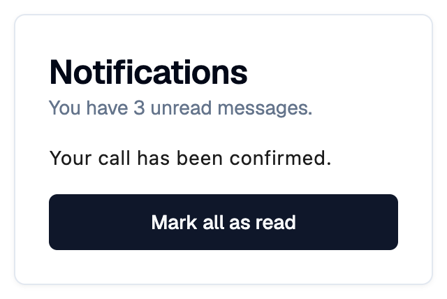
A Shadcn card with an optional header, content and footer.
Example:
shad.Card(
    title="Notifications",
    description="You have 3 unread messages.",
    content=ft.Text("..."),
    footer=shad.Button("Mark all as read"),
)
Inherits: LayoutControl
Properties
bgcolor- The background color.border_radius- The corner radius.content- The main content of this card.description- The description shown belowtitle.footer- The control shown at the bottom of this card.leading- A control shown before the column oftitle,description,contentandfooter.padding- The space between the border of this card and its contents.title- The title shown at the top of this card.trailing- A control shown after the column oftitle,description,contentandfooter.
Example
Shadcn Card
play_arrowTry Online
import flet_shadcn_ui as shad

import flet as ft


def main(page: ft.Page):
    page.title = "Shadcn Card"

    def handle_create(e: ft.Event[shad.Button]):
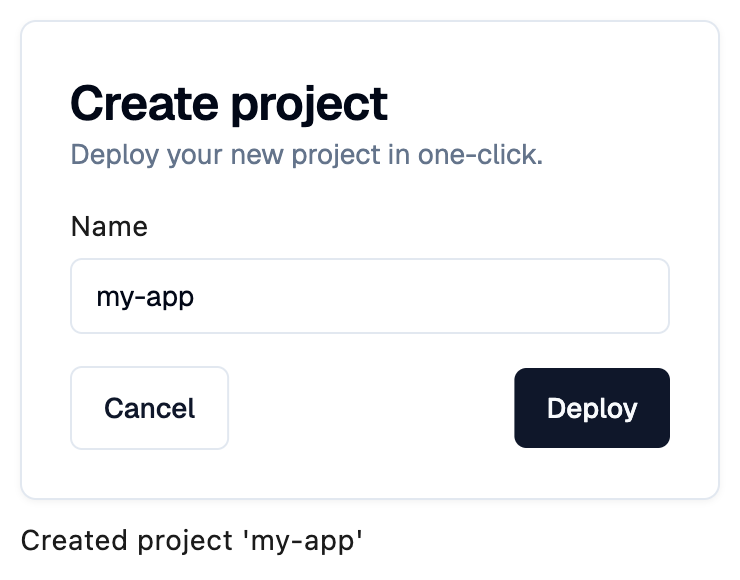
        status.value = f"Created project '{name.value}'"

    name = shad.Input(key="name", placeholder="Name of your project")
    status = ft.Text()

    page.add(
        ft.SafeArea(
            content=ft.Column(
                controls=[
                    shad.Card(
                        width=350,
                        title="Create project",
                        description="Deploy your new project in one-click.",
                        content=ft.Container(
                            padding=ft.Padding.symmetric(vertical=16),
                            content=ft.Column(
                                spacing=6,
                                controls=[ft.Text("Name"), name],
                            ),
                        ),
                        footer=ft.Row(
                            alignment=ft.MainAxisAlignment.SPACE_BETWEEN,
                            controls=[
                                shad.Button(
                                    "Cancel", variant=shad.ButtonVariant.OUTLINE
                                ),
                                shad.Button("Deploy", on_click=handle_create),
                            ],
                        ),
                    ),
                    status,
                ],
            )
        )
    )


if __name__ == "__main__":
    ft.run(main)
Properties
bgcolorclass-attributeinstance-attribute
bgcolor: ColorValue | None = NoneThe background color.
If None, the card color of the theme is used.
border_radiusclass-attributeinstance-attribute
border_radius: BorderRadiusValue | None = NoneThe corner radius.
If None, the theme radius is used.
contentclass-attributeinstance-attribute
content: Control | None = NoneThe main content of this card.
descriptionclass-attributeinstance-attribute
description: StrOrControl | None = NoneThe description shown below title.
footerclass-attributeinstance-attribute
footer: Control | None = NoneThe control shown at the bottom of this card.
leadingclass-attributeinstance-attribute
leading: Control | None = NoneA control shown before the column of title, description,
content and footer.
paddingclass-attributeinstance-attribute
padding: PaddingValue | None = NoneThe space between the border of this card and its contents.
If None, defaults to 24 on every side.
titleclass-attributeinstance-attribute
title: StrOrControl | None = NoneThe title shown at the top of this card.