Theme
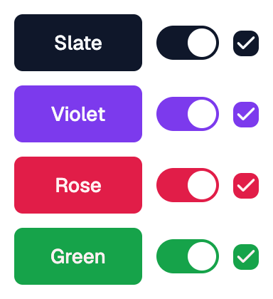
Applies a Shadcn theme to its content.
All flet_shadcn_ui controls inside content use this theme.
Wrapping controls in a Theme is optional: a control without a Theme
ancestor uses the SLATE color scheme and
follows the page's light or dark mode.
Example:
shad.Theme(
    color_scheme=shad.ColorScheme.VIOLET,
    content=shad.Button("Themed"),
)
Inherits: LayoutControl
Properties
brightness- Whether to use the light or dark variant ofcolor_scheme.color_scheme- The color scheme to use.content- The control to apply the theme to.radius- The default corner radius of themed controls.
Example
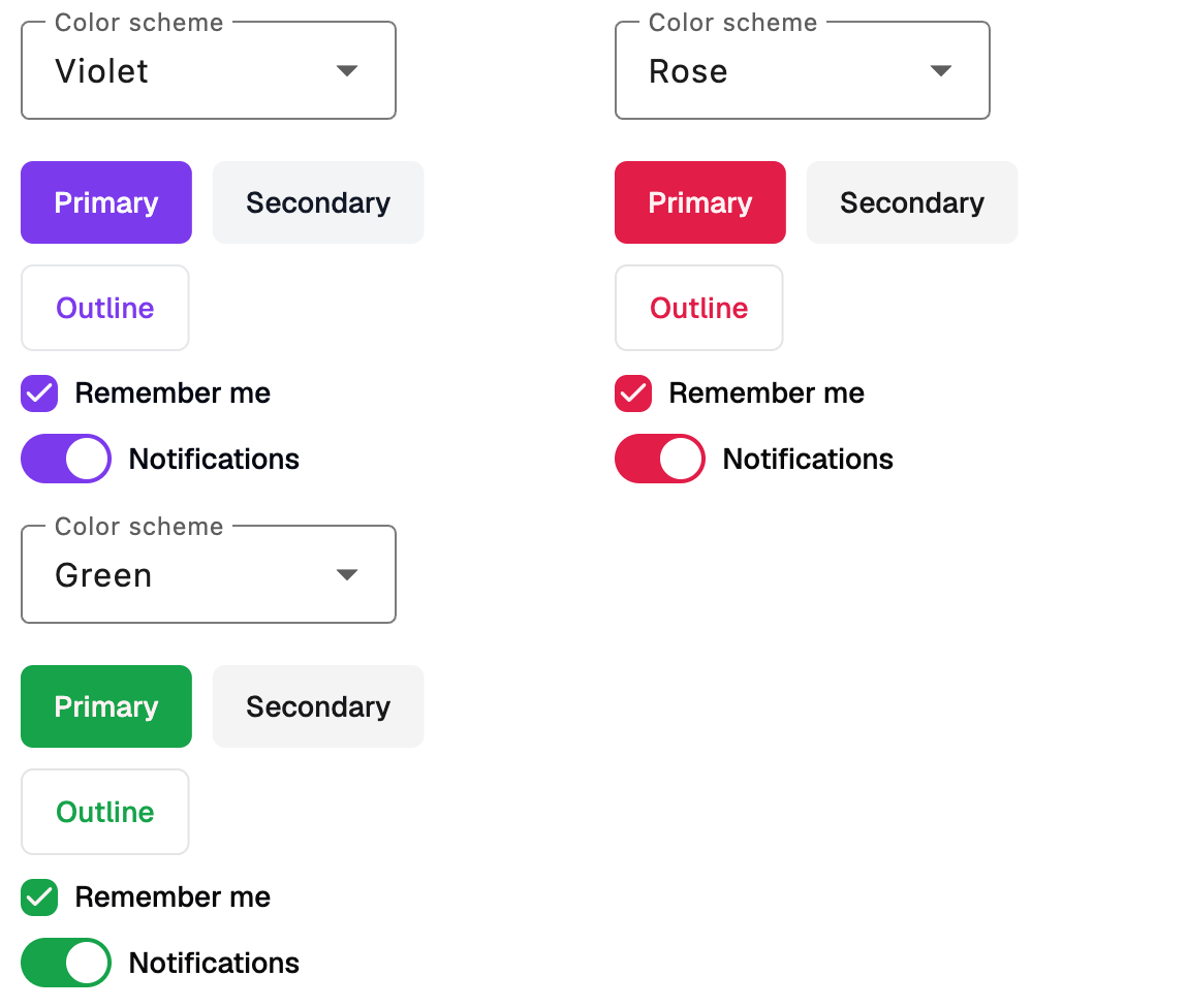
Shadcn Theme
play_arrowTry Online
import flet_shadcn_ui as shad

import flet as ft


def main(page: ft.Page):
    page.title = "Shadcn Theme"

    def handle_scheme_change(e: ft.Event[ft.Dropdown]):
        theme.color_scheme = shad.ColorScheme(e.control.value)

    theme = shad.Theme(
        color_scheme=shad.ColorScheme.VIOLET,
        content=ft.Column(
            controls=[
                ft.Row(
                    wrap=True,
                    controls=[
                        shad.Button("Primary"),
                        shad.Button("Secondary", variant=shad.ButtonVariant.SECONDARY),
                        shad.Button("Outline", variant=shad.ButtonVariant.OUTLINE),
                    ],
                ),
                shad.Checkbox(label="Remember me", value=True),
                shad.Switch(label="Notifications", value=True),
            ],
        ),
    )

    page.add(
        ft.SafeArea(
            content=ft.Column(
                spacing=20,
                controls=[
                    ft.Dropdown(
                        key="color_scheme",
                        label="Color scheme",
                        value=shad.ColorScheme.VIOLET.value,
                        options=[
                            ft.DropdownOption(key=s.value, text=s.name.title())
                            for s in shad.ColorScheme
                        ],
                        on_select=handle_scheme_change,
                    ),
                    theme,
                ],
            )
        )
    )


if __name__ == "__main__":
    ft.run(main)
Properties
brightnessclass-attributeinstance-attribute
brightness: Brightness | None = NoneWhether to use the light or dark variant of color_scheme.
If None, follows the brightness of the page theme.
color_schemeclass-attributeinstance-attribute
color_scheme: ColorScheme = ColorScheme.SLATEThe color scheme to use.
radiusclass-attributeinstance-attribute
radius: BorderRadiusValue | None = NoneThe default corner radius of themed controls.
If None, defaults to 6 on every corner.