Select
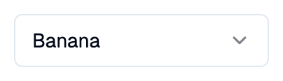
A Shadcn select: a button that opens a list of options to choose one from.
Example:
shad.Select(
    placeholder="Select a fruit",
    options=[
        shad.SelectOption(value="apple", text="Apple"),
        shad.SelectOption(value="banana", text="Banana"),
    ],
)
Inherits: LayoutControl
Properties
allow_deselection- Whether choosing the selected option again clearsvalue.description- Helper text shown below this select.error_text- An error message shown in red below this select.label- The label shown above this select.max_height- The largest height of the list of options before it scrolls.min_width- The smallest width of the closed select and its list of options.options- The options to choose from.placeholder- The content shown while no option is chosen.value- Thevalueof the chosen option.
Events
on_change- Called when the chosen option changes.
Example
Shadcn Select
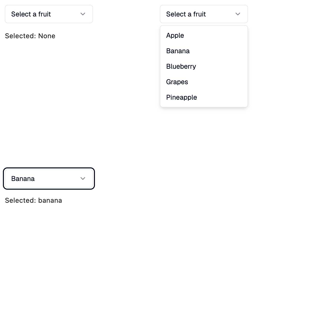
import flet_shadcn_ui as shad

import flet as ft

FRUITS = ["Apple", "Banana", "Blueberry", "Grapes", "Pineapple"]


def main(page: ft.Page):
    page.title = "Shadcn Select"

    def handle_change(e: ft.Event[shad.Select]):
        selection.value = f"Selected: {e.control.value}"

    selection = ft.Text("Selected: None")

    page.add(
        ft.SafeArea(
            content=ft.Column(
                spacing=16,
                controls=[
                    shad.Select(
                        placeholder="Select a fruit",
                        min_width=180,
                        on_change=handle_change,
                        options=[
                            shad.SelectOption(value=fruit.lower(), text=fruit)
                            for fruit in FRUITS
                        ],
                    ),
                    selection,
                ],
            )
        )
    )


if __name__ == "__main__":
    ft.run(main)
Properties
allow_deselectionclass-attributeinstance-attribute
allow_deselection: bool = FalseWhether choosing the selected option again clears value.
descriptionclass-attributeinstance-attribute
description: StrOrControl | None = NoneHelper text shown below this select.
error_textclass-attributeinstance-attribute
error_text: str | None = NoneAn error message shown in red below this select. The border turns red too.
Set it after validating the value, and set it back to None (or an empty
string) to clear the error.
labelclass-attributeinstance-attribute
label: StrOrControl | None = NoneThe label shown above this select.
It turns red while error_text is set.
max_heightclass-attributeinstance-attribute
max_height: Number | None = NoneThe largest height of the list of options before it scrolls.
If None, defaults to 384.
min_widthclass-attributeinstance-attribute
min_width: Number | None = NoneThe smallest width of the closed select and its list of options.
If None, defaults to 128.
optionsclass-attributeinstance-attribute
options: list[SelectOption] = field(default_factory=list)The options to choose from.
placeholderclass-attributeinstance-attribute
placeholder: StrOrControl | None = NoneThe content shown while no option is chosen.
valueclass-attributeinstance-attribute
value: str | None = NoneThe value of the chosen option.
If None, placeholder is shown.
Events
on_changeclass-attributeinstance-attribute
on_change: ControlEventHandler[Select] | None = NoneCalled when the chosen option changes.
The data property of the event handler argument
contains the new value, or None if it was cleared.