Popover
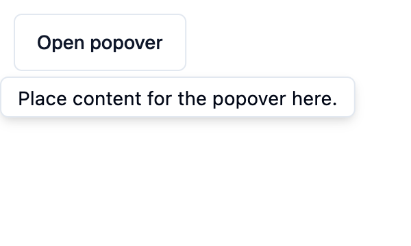
A Shadcn popover: a floating panel attached to content, opened and
closed with open.
Example:
def toggle(e):
    popover.open = not popover.open


popover = shad.Popover(
    content=shad.Button("Open popover", on_click=toggle),
    popover=ft.Text("Place content for the popover here."),
)
Inherits: LayoutControl
Properties
close_on_tap_outside- Whether tapping outside the popover closes it.content- The control the popover is attached to.open- Whether the popover is shown.popover- The control shown in the floating panel.
Events
on_dismiss- Called when the popover is closed by tapping outside it.
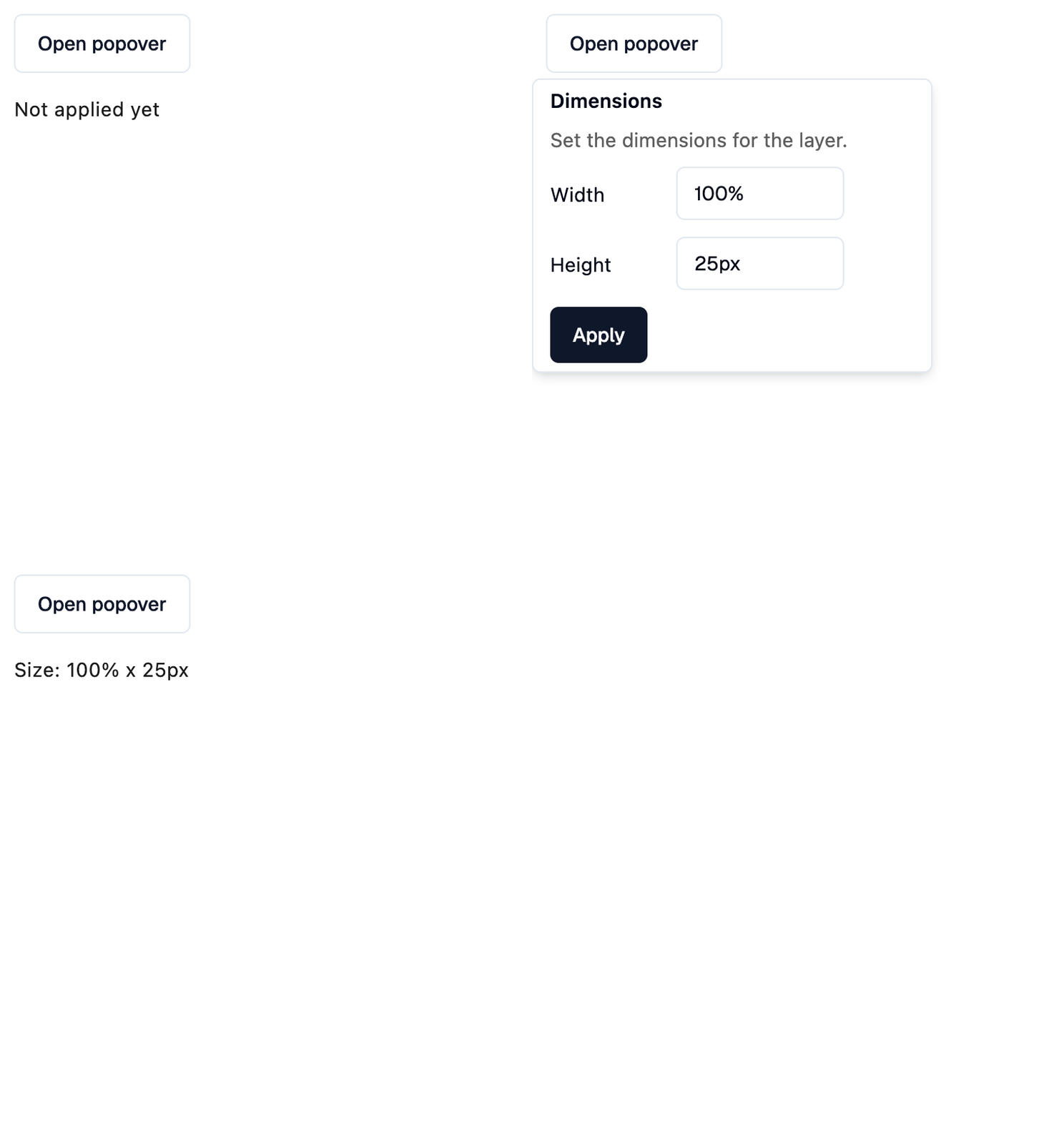
Example
Shadcn Popover
play_arrowTry Online
import flet_shadcn_ui as shad

import flet as ft


def main(page: ft.Page):
    page.title = "Shadcn Popover"

    def toggle(e: ft.Event[shad.Button]):
        popover.open = not popover.open

    def handle_dismiss(e: ft.Event[shad.Popover]):
        status.value = "Closed by tapping outside"

    def apply(e: ft.Event[shad.Button]):
        popover.open = False
        status.value = f"Size: {width.value} x {height.value}"

    width = shad.Input(value="100%", width=120)
    height = shad.Input(value="25px", width=120)
    status = ft.Text("Not applied yet")

    popover = shad.Popover(
        on_dismiss=handle_dismiss,
        content=shad.Button(
            "Open popover", variant=shad.ButtonVariant.OUTLINE, on_click=toggle
        ),
        popover=ft.Column(
            width=260,
            tight=True,
            spacing=12,
            controls=[
                ft.Text("Dimensions", weight=ft.FontWeight.W_600),
                ft.Text(
                    "Set the dimensions for the layer.",
                    color=ft.Colors.ON_SURFACE_VARIANT,
                ),
                ft.Row([ft.Text("Width", width=80), width]),
                ft.Row([ft.Text("Height", width=80), height]),
                shad.Button("Apply", on_click=apply),
            ],
        ),
    )

    page.add(ft.SafeArea(content=ft.Column(spacing=16, controls=[popover, status])))


if __name__ == "__main__":
    ft.run(main)
Properties
close_on_tap_outsideclass-attributeinstance-attribute
close_on_tap_outside: bool = TrueWhether tapping outside the popover closes it.
Events
on_dismissclass-attributeinstance-attribute
on_dismiss: ControlEventHandler[Popover] | None = NoneCalled when the popover is closed by tapping outside it.
open is set to False before this is called.