Checkbox
A Shadcn checkbox.
Example:
shad.Checkbox(
    label="Accept terms and conditions",
    sublabel="You agree to our Terms of Service and Privacy Policy.",
)
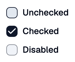
Inherits: LayoutControl
Properties
color- The fill color when checked.error_text- An error message shown in red below this checkbox.label- The label shown next to this checkbox.size- The width and height of the checkbox square.sublabel- Secondary text shown belowlabel.unchecked_color- The fill color when unchecked.value- Whether this checkbox is checked.
Events
Example
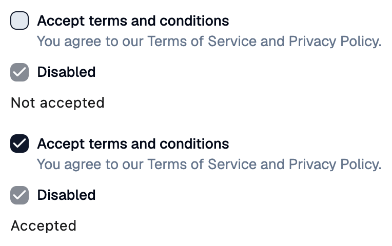
Shadcn Checkbox
play_arrowTry Online
import flet_shadcn_ui as shad

import flet as ft


def main(page: ft.Page):
    page.title = "Shadcn Checkbox"

    def handle_change(e: ft.Event[shad.Checkbox]):
        status.value = "Accepted" if e.control.value else "Not accepted"

    status = ft.Text("Not accepted")

    page.add(
        ft.SafeArea(
            content=ft.Column(
                controls=[
                    shad.Checkbox(
                        label="Accept terms and conditions",
                        sublabel=(
                            "You agree to our Terms of Service and Privacy Policy."
                        ),
                        on_change=handle_change,
                    ),
                    shad.Checkbox(label="Disabled", value=True, disabled=True),
                    status,
                ],
            )
        )
    )


if __name__ == "__main__":
    ft.run(main)
Properties
colorclass-attributeinstance-attribute
color: ColorValue | None = NoneThe fill color when checked.
If None, the primary color of the theme is used.
error_textclass-attributeinstance-attribute
error_text: str | None = NoneAn error message shown in red below this checkbox. The box border turns red too.
Set it after validating the value, and set it back to None (or an empty
string) to clear the error.
labelclass-attributeinstance-attribute
label: StrOrControl | None = NoneThe label shown next to this checkbox.
sizeclass-attributeinstance-attribute
size: Number | None = NoneThe width and height of the checkbox square.
If None, defaults to 16.
sublabelclass-attributeinstance-attribute
sublabel: StrOrControl | None = NoneSecondary text shown below label.
unchecked_colorclass-attributeinstance-attribute
unchecked_color: ColorValue | None = NoneThe fill color when unchecked.
Events
on_changeclass-attributeinstance-attribute
on_change: ControlEventHandler[Checkbox] | None = NoneCalled when value changes.
The data property of the event handler argument
contains the new value.